Hello! I have Rachel Greene here today to talk about some tricks for formatting your paperback editions. Rachel formats professionally for her small business
Penoaks Publishing, so I think that she just might know what she's talking about.
Rachel writes under the penname "Aubrey Hansen." I've read both her books
Red Rain and
Peter's Angel, and quite enjoyed them.
Find Aubrey/Rachel on the interwebs.
As someone who formats her own books, I'll let you know that it's no simple business, and I probably have room for improvement. I'll let Rachel have the floor now -
You know what's annoying about readers? They don't listen to you! You give them very simple instructions, like "Don't judge a book by its cover," then they go and do
just that! But they don't stop there, oh no! As if being picky about covers isn't enough, then they go on and judge the book by its
interior too! Not only does it have to have a nice cover, but the guts have to look good too!
Okay, okay, I guess we can't be too hard on readers. An improperly formatted book is very difficult to read, like trying to decipher a letter from a friend with atrocious handwriting. (We all know
that one person!) What's worse, bad formatting pulls the reader out of the story, making them focus on the packaging instead of the words themselves. And as every writer knows, the last thing we want to do is pull our readers out of the story.
But the good news is that proper formatting doesn't have to be fancy. In fact, for most books, simpler is better. By following a few rules of the trade, it's easy to create a crisp layout that meets industry standards and makes your book look professional, while allowing your words to shine through. Below are 7 easy formatting tricks that you can apply to your next project to take it to the next level.
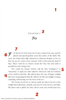
Start your chapters on the right-hand page. Industry standards dictate that all important content (title page, dedication page, first pages of each chapter) should start on the right-hand (odd-numbered) page. Making this easy change is a great way to add a level of professionalism to your layout. This may result in some blank pages in between chapters, but that's okay--just make sure your blank pages don't have page numbers or headers/footers!
No headers/footers or page numbers on the first page of chapters. Similarly, the first pages of your chapters and sections will look cleaner and classier if they don't have headers, footers, or page numbers.
Small caps. Small caps, which can be found in the "font" menu of most programs, is a great way to add sophistication to a layout. It's also a great way to add variety without having to use a different font. It's a nice touch if you're using a serif font or want to keep the layout clean and professional.
Avoid using Times New Roman, Arial, Courier New, and Calibri. While you want your body text to be in a simple, readable font, avoid overused system fonts. Times New Roman and Courier New are academic fonts used for term papers and manuscript submissions. For a published book, Garamond, Goudy Old Style, and Baskerville Old Face are also common, basic fonts that have just enough character to be classy.
Line spacing. For some books, where space is premium, you'll want to keep your line spacing at the default single-spaced. But for most novels, boosting your line spacing to 1.15 or even 1.25 can make your text much more readable by allowing the lines to breathe. But don't make it any wider than 1.5, or your book will look like a double-spaced manuscript. (Children's books and easy readers might be the exception to this.)
Drop caps. The oldest trick in the book, drop caps have been used since the days of illuminated texts. A simple drop-cap dropped two or three lines is an easy way to add style and vintage flare to your layouts. Just make sure to format them properly using your program's drop cap feature, and don't try to force it manually or by using a text box, as it won't look as pretty.
Left-align the first line of chapters and scenes. Left-aligning (no indent) the first line of new chapters and the first line after a scene break is an excellent way to make your book more professional, plus it helps visually differentiate the new section.
~~~~~~~~~~~~~~~~~~~~~~~~~~~~~~~~~~~~~~~~~~~~~~~~~~~~~~~~~~~~~~~~
Okay, Kendra back real quick to put in a word about kindle formatting. It's a whole 'nother beast. I, unfortunately, didn't get anyone to talk about it as part of e-Con, but I do have this awesome post that I found elsewhere that you guys might will find helpful.


